
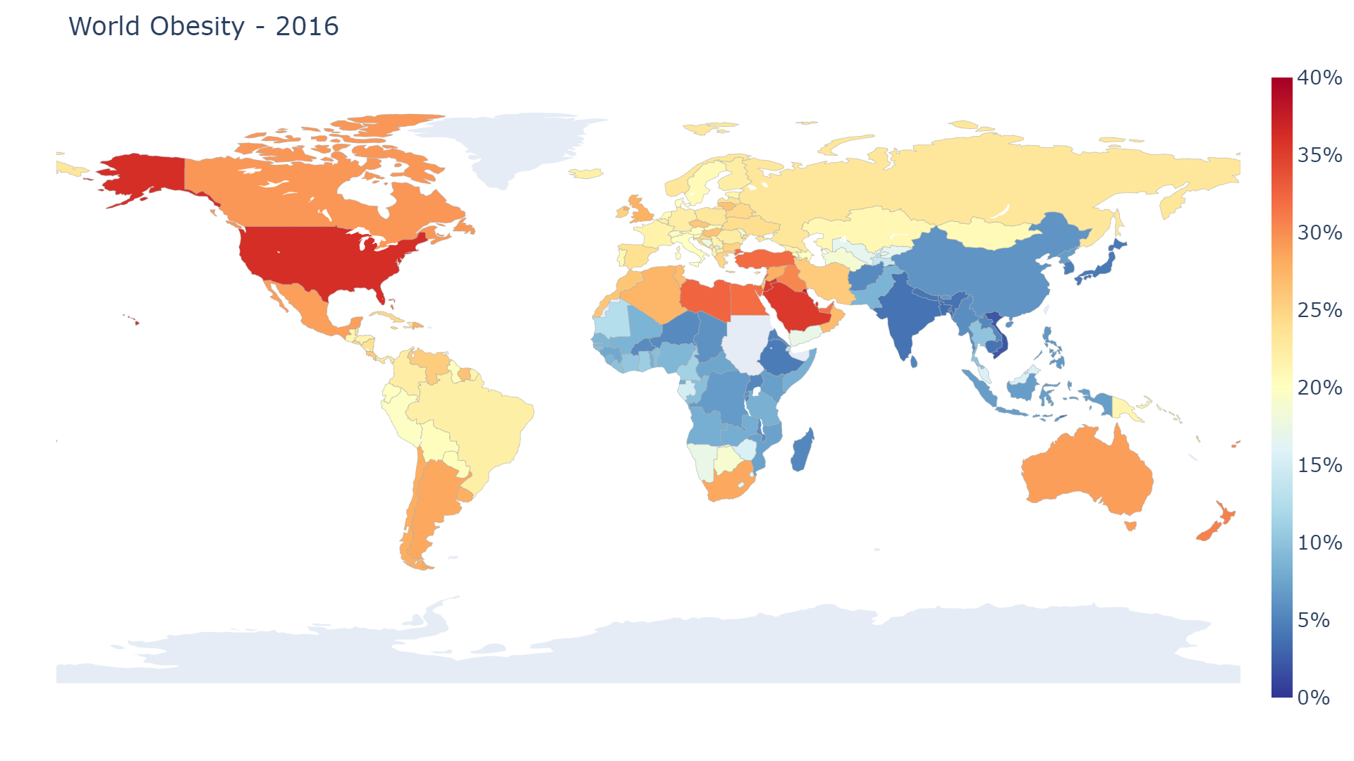
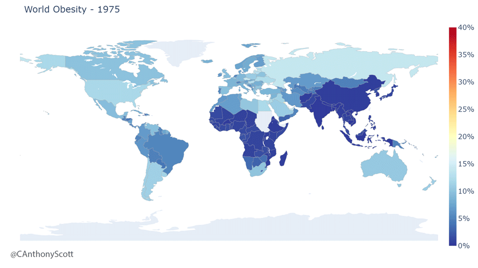
The world-wide rise of obesity
The entire world is currently experiencing an obesity epidemic. This map shows world-wide obesity rates from 1975-2016
I Made an animated gif for a talk. I thought it looked nice. Here it is below!
I am giving a talk at an upcoming conference and I wanted to show a figure of increasing obesity rates across the world. I couldn't find a pre-made one that I liked, so I went head and created my own. It's nothing special, but I thought it ended up looking pretty nice.
Data source: OurWorldInData
Visualization: Plotly for Python to make the maps with animation created with Photoshop
Code used to generate the maps
Here are the code snippets I used to generate the maps:
import plotly.graph_objects as go
import pandas as pd
data = pd.read_csv(r"share-of-adults-defined-as-obese.csv")

layout = go.Layout(
    font=dict(size=28)
)

for i in range(1975, 2017):
    df = data[data['Year'] == i]

    fig = go.Figure(
        data=go.Choropleth(
            locations=df['Code'],
            z=df['Share of adults who are obese (%)'],
            text=df['Entity'],
            colorscale="RdYlBu",
            zauto=False,
            zmax=40,
            zmin=0,
            reversescale=True,
            autocolorscale=False,
            marker_line_color="darkgray",
            marker_line_width=0.5,
            colorbar_ticksuffix = "%"
        ),
        layout=layout
    )

    fig.update_layout(
        title_text = 'World Obesity - {}'.format(i),
        title_font_size=36,
        geo=dict(
            showframe=False,
            showcoastlines=False,
            projection_type='equirectangular',
        )

    )

    fig.write_image("obesity_plots/WorldObesity_{}.png".format(i), height=1080, width=1920)